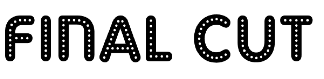
As a pair we had already decided our film horror trailer masthead was going to be, 'Wild Fear'. However we did not know what typography to use so we decided to gather audience feedback from Poll Everywhere to help us decide. We came to the same problem when choosing the typography for our magazine masthead which we decided to name, 'Final Cut' because we believed it to be very catchy and direct.
We gave our target audience four options to chose from for our film title typography.
1. 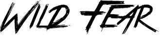 3. 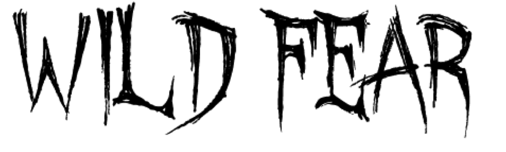 5. 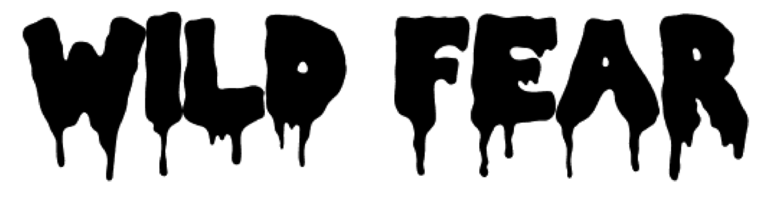 | 2.
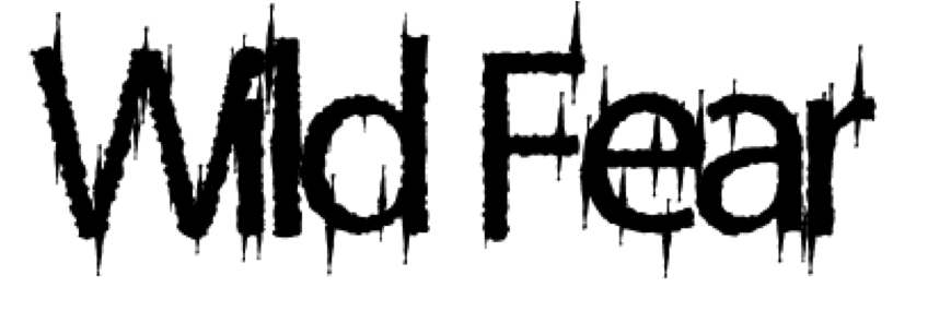 4. 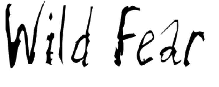 |
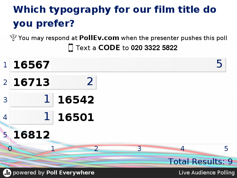
From our research we discovered that our target audience favoured the first typography for our horror trailer title. This typography is bold, stands out and has a wildness effect whereas the others did not promote the location as well as the first typography.
We gave our target audience another four options to chose from but this time it was for our masthead typography.
1.  3. 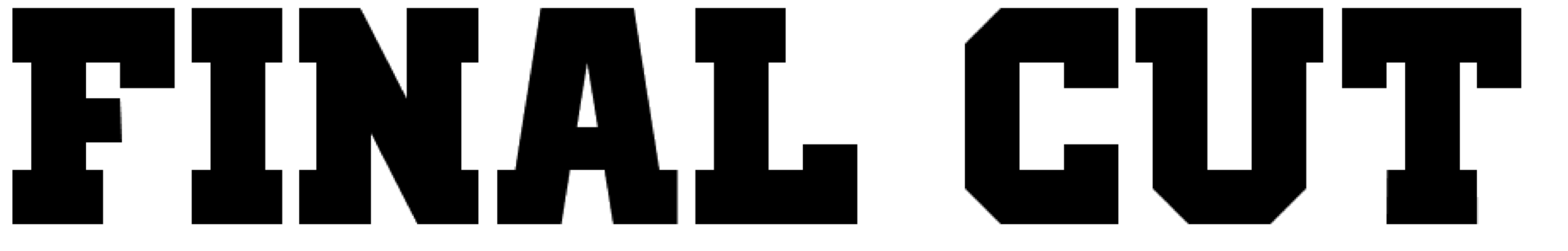 | 2. 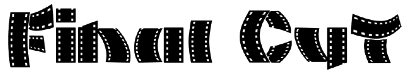 4. 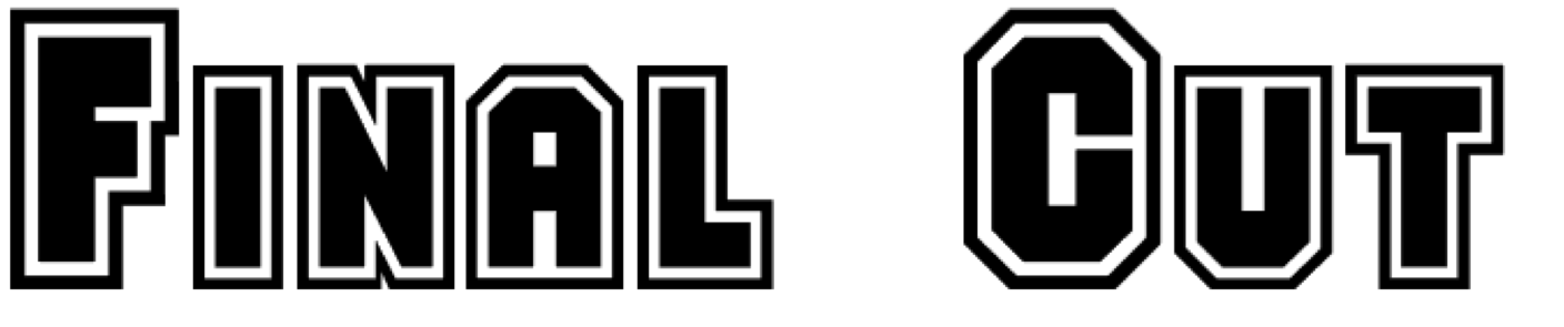 |
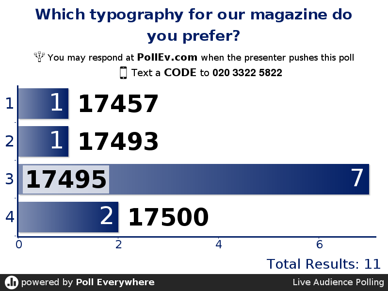
From our research we discovered that our target audience picked typography number 3, which means this will be used for our masthead on our film magazine cover. This typography is bold, upbeat and stands which is similar to other film magazines we have researched and analysed.